CUSTOM LOGO-TYPE
By: Claire Coullon Graphic Design & Typography
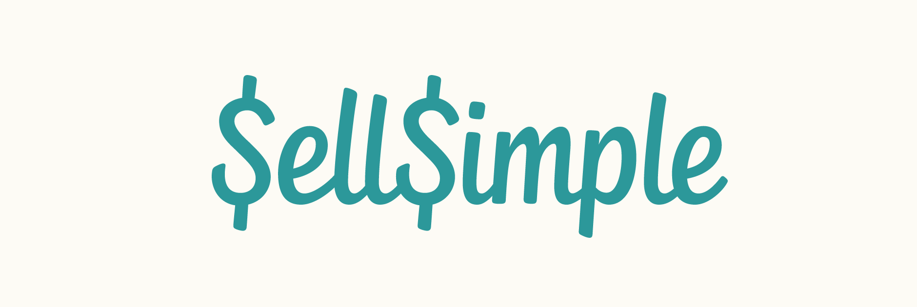
Custom typography logo design for SellSimple, a new web and mobile platform allowing you to easily sell and buy items in a simple, hassle-free way. The team were looking for a recognisable but clean script that would be very readable at small sizes as the mobile application was to be one of the primary uses. The S was to double as a $ sign and also function as the icon.
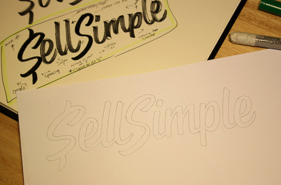
After roughly drawing out the words using a couple of different pens, I settled on a heavy brush tip marker as it formed a quite dynamic overall look. Keeping in mind the intended use, I kept quite a compact, very ‘together’ logo shape from the very beginning, as this would make it easier to place inside limited spaces (like the iPhone application header). The capital and ascender height don’t extend too far past the lower case letters and the x-height is quite tall, preventing the letters from appearing too small or squished even when scaled down significantly.
SKETCH & REVISIONS
The first version accentuated the custom drawn nature of the design through its individually designed letters across repeated characters (notably the ‘S’) and a distinctive connection between both words. Revisions focused on making both ‘S’s identical so that the icon could feature both initials and giving them a more vertically symmetrical shape. Consequently, the overall angle of the other letters was also adjusted to be more upright to match.
CLIENT: SellSimple
DATE: June 2012
WORK DONE: Logo-type design, custom lettering
CUSTOM LOGO-TYPE
Custom typography logo design for SellSimple, a new web and mobile platform allowing you to easily sell and buy items in a simple, hassle-free way. The team were looking for a recognisable but clean script that would be very readable at small sizes as the mobile application was to be one of the primary uses. The S was to double as a $ sign and also function as the icon.
After roughly drawing out the words using a couple of different pens, I settled on a heavy brush tip marker as it formed a quite dynamic overall look. Keeping in mind the intended use, I kept quite a compact, very ‘together’ logo shape from the very beginning, as this would make it easier to place inside limited spaces (like the iPhone application header). The capital and ascender height don’t extend too far past the lower case letters and the x-height is quite tall, preventing the letters from appearing too small or squished even when scaled down significantly.
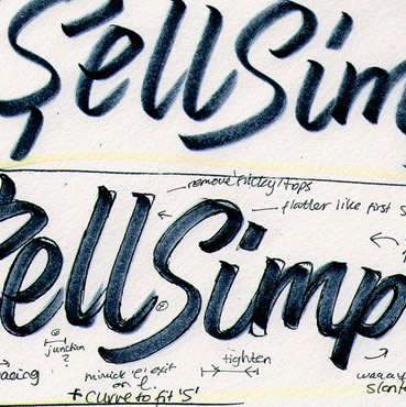
Above: Some of the marker drafts along with the initial pencil design.
SKETCH & REVISIONS
The first version accentuated the custom drawn nature of the design through its individually designed letters across repeated characters (notably the ‘S’) and a distinctive connection between both words. Revisions focused on making both ‘S’s identical so that the icon could feature both initials and giving them a more vertically symmetrical shape. Consequently, the overall angle of the other letters was also adjusted to be more upright to match.
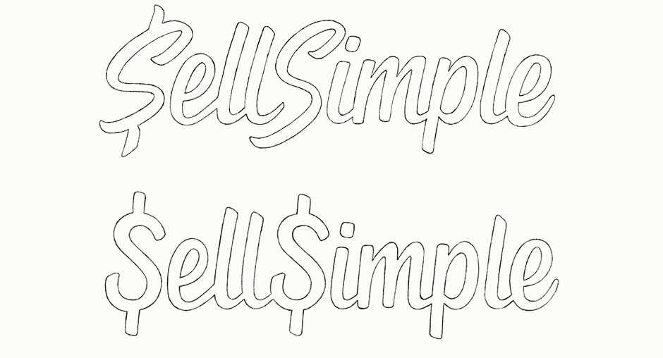
Above: Changes made from the first iteration to the revised concept.
DIGITAL VERSION
With the revised sketch approved, vectoring was the next step. Adjusting the letters to relatively strict guidelines helped to accent a quite clean and balanced overall design that would remain clear and neat, even at widths below 100 pixels.
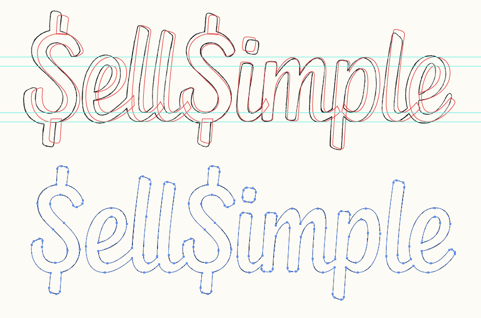
Above: Screenshots of the final sketch with the vectored outline and anchor point placement.
ICON ADAPTATION
When drawing the sketch, I had tested the ‘S’ pair to make certain that they would fit next to each other well and that the lower left curve wouldn’t extend too far, potentially forcing a much wider gap between the top parts. The lightly rounded edges of the container square mirror the subtle rounded edges of the lettering.

Above: Progression of the double ‘S’ icon, from sketch form (far left) through to digital colour variations.
FINAL LOGO
We also created two stylised versions of logo to emphasise a sense of coherence with the interface design in terms of visual treatment. Shown in use below in a screenshot of the SellSimple commercial and on the company website. All video and website work by the SellSimple team.

– J


mrankinmatt
Apr 21, 2013 -
I am to the point where I need to design a logo for my internet startup – a social network. I will either have one of the top national firms design the logo (such as LogoBee or Logo Design Guru) or else contract a very good graphic designer. Would any of you have any concerns about using a large national firm to design a logo instead of finding a good individual to do it?
supernerd567
Apr 21, 2013 -
Looking for an online firm providing excellent designing services especially logo designs. There are countless of online designing firms out there on the Net but it is hard to choose. Would greatly appreciate input from anyone who had experienced with any online designing firms/companies/sites. Thanks.
josh12rox
Apr 21, 2013 -
i am a small home business and looking for business in creating logo design, problem is all established businesses already have a logo design…how do i find new businesses that don’t already have logo design? is there a register that contains this info and is accessable? all help very appreciated!
Jose B
Apr 21, 2013 -
I want to double major in kinesiology and logo design? .. I wonder any good universities that provide good programs for logo design? In california
crzyinluv
Apr 21, 2013 -
I am looking to put a logo design with our name so that we can make business cards, create letterhead, and remake our website. What tips and techniques can you give me? My company name is Smack Sound Mobile DJs and we, as the name says, are mobile DJs. Any ideas?
nmlpc
Apr 21, 2013 -
I’m starting a small business online and am shopping around for affordable yet good quality logo designs on the Internet as I am on a very strict budget. Does anyone have any suggestions on some respectable sites I can check out? Thanks in advance.
joevsyou
Apr 21, 2013 -
Please suggest me how can i create a best logo design??
_marky_mark_
Apr 21, 2013 -
I need a logo design software which can produce high quality logo, like in vector graphics format. anybody can give any suggestion?
Dana G
Apr 21, 2013 -
Here’s the lowdown there is a local gym near me that has a logo design that looks awful. I decided to take the time and design them a logo. What would you do to attract them as a client. What is the right way to show them the logo design. Should I drop it off at the gym?
hank baseballs
Apr 21, 2013 -
I want to download a free logo design tool which has almost all features to design best logos. Is there any such tool available?
NC Baller
Apr 21, 2013 -
An auto repair shop commissioned me to make a logo design for their company, I wanna know how much should I charge them for my work. They absolutely like my work and they are also a decent company because their shop is really big and spacious. I was able to finish my work in 1 wk. I am freelancer with 2 years work experience.
In US Dollars or Philippine Peso pls.. thanks.
ibjammin44
Apr 21, 2013 -
I have the latest version of Logo Design Studio Pro and I am having a difficult time using it. I need a high resolution logo for use on my website and I can’t seem to get a grasp on the program. How high should the resolution be for use on a website? I think the highest resolution is 999 pixels. Please help.
Motordom
Apr 21, 2013 -
There are a whole lot of playful logo designs available, and they are just adorable. But is it better to use these logos than the usual medical logos?
friendly 4
Apr 21, 2013 -
I have a small business and need a logo design. How much should i offer to get a logo design.
rashest_hippo
Apr 21, 2013 -
Hey guys,
I am creating my new website, i want to get my new brand logo designed. So, suggest me from where i can get my logo designed online for free or cheap prices.
Cheers!
Ssshhhh Im becoming aroused
Apr 21, 2013 -
I am looking for an easy to use but powerful logo design application for mac. Would be nice to have a lot of presets and objects ready to use.
nick s
Apr 21, 2013 -
I am about to start a business for making desserts and i really suck at art or logo designs. I wanna design a logo for the business so i can make a Facebook page and fliers to hand out
Ryan Z
Apr 21, 2013 -
I have just completed a logo design for a concierge service dealing with luxury high-end brands. The items range from $400 – $20,000. Granted it’s a small start-up business but since it is dealing with luxury items, I am not very sure how to charge them. Please help! (I was in graphic design but I’m now in a different industry. I freelance when I’m free)
Myles
Apr 21, 2013 -
I have looked at a lot of websites and read a couple of books about logo design and brand identity and I have noticed that many people tend to give different views of the different types of identies that there are and some people tend to mix them up. Some people say there are only 3 categories some people say there is 4 some say 5 I know of 9 listed shown below but i’m not sure if i’m right or wrong but these are just ones that I have read of on different websites and books.
1. Combination
2. Symbolic
3. Wordmark
4. Lettermark
5. Letterform
6. Emblem
7. Pictorialmark
8. Abstract mark
9. Brand marks
What I would like to know is what are the official categories for the logo & brand identity design
Picean
Apr 21, 2013 -
I hope to start my own logo designing business soon. And I’ve heard that many logo designers use macromedia freehand. But I was wondering If I could use Gimp 2.6 for the job?
Ryan Z
Apr 21, 2013 -
Hi,
I am in process of registering my company for that i need a logo. can any one suggest if any one of you has previous experience of using online logo design firms ? Are they trust-able ?
Matthew
Apr 21, 2013 -
Where can I find logo company that offers custom logo design? also those who are willing to do multiple revision on the logo design. Good logo designers please.
Courtney
Apr 21, 2013 -
I’m looking to have a logo designed for my business. Most of the freelance folks I know are very defence about viewing their once hobby as their now profession. Although my budget is limited, I would like to pay an appropriate amount for work though the price ranges I’ve seen for logo design vary greatly as well as quality and creativity. I’ve also noticed the high bill rates don’t always correlate with high quality work and vice versa.
I would like to maybe post an ad on Craigslist (or possibly some other eFreelance site – please recommend if you have good experiences) stating my budget and provide some work that I like and examples of the overall vision of the company and goal for the logo.
What’s the next step? Do I ask people to send me drafts or mockups? quick things that may not take a lot of skill other than a creative mind and pen & paper? what if someone sends me something that I think sucks? What if someone sends me a great idea?
Would love to hear from some freelancers on their opinion and offer some advice. Thanks!
Jermaine J
Apr 21, 2013 -
Hey – I’m 13 (young, I know!) and would like to know what software is best for logo design – photoshop CS3 or illustrator? Or any other software?
Thanks
PS> Do I need any additional hardware, or is a mouse enough?
juliansarokin
Apr 21, 2013 -
Both work – I personally like photoshop, but I know a ton of designers who use illustrator.
musicistabest
Apr 21, 2013 -
My friend suggested me about a web design and logo design company in kitchener, Owner Umberto Micheli, and website http://www.thinkwebpower.com. Any suggestions ?
Sir fliesalot
Apr 21, 2013 -
Preferably one which can provide the logo design within a 24 hours time frame. I know it is hard to find one. I don’t mind paying extra for the logo design as long as I can get it quick. Anyone has suggestions? Of course the quality of the logo design matters. I don’t want it to be done haphazardly although I do expect some compromise in the quality.
kewlflame14
Apr 21, 2013 -
Minimal Logo Design Trend is a growing trend of logo design industry but don’t you think clients find minimal designs boring?
I want to create a minimal design for a client but not sure if he would approve :S Any Suggestions?
Beavis
Apr 21, 2013 -
I’m a fairly experienced designer and want to know what you all think is fair for this deal:
Logo designs (20 mockups with up to 5 revisions of desired mockups)
Business cards (10 mockups)
Letterhead and Envelope designs (with template)
So I was thinking that $800.00 would be sufficient for the total job cost. What do you think?
Gage
Apr 22, 2013 -
I’m a fairly experienced designer and want to know what you all think is fair for this deal:
Logo designs (20 mockups with up to 5 revisions of desired mockups)
Business cards (10 mockups)
Letterhead and Envelope designs (with template)
So I was thinking that $800.00 would be sufficient for the total job cost. What do you think?